![David Molnar [Update:, PhD]](https://www.srcf.ucam.org/~dm516/wp-content/themes/twentyeleven/images/headers/chessboard.jpg)
User interfaces connect users to software. If good, UI give access to all functions, please the eye, radiate power and trustworthiness. They unobtrusively do their job, and sometimes, they even make happy. Powerful software amounts to nothing if it can’t speak with its users. How can we make the best possible UI, and how can artificial intelligence help computers talking to humans?
Being made for humans, a UI must work with human faculties and limitations. Keeping those faculties and limitations in mind, we can go a long way towards making a good UI without using any AI. But we will see that only AI can ultimately solve the fundamental dilemma of how to make powerful software that is also easy to use.
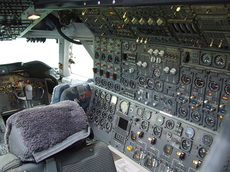
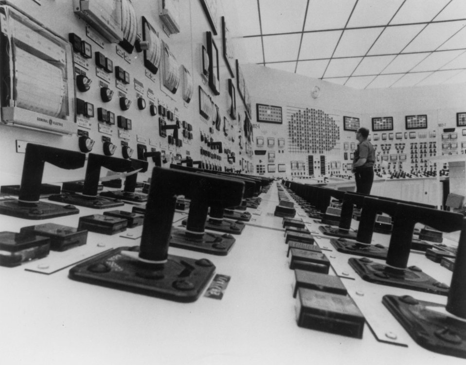
The more powerful software is, the more functions it has. From these the user has to select the ones she needs. The simplest method is to offer up all functions at all times for selection. That can be super fast access, and sometimes just that is needed. Airplanes used to have cockpits full of switches and dials. So did nuclear power plants. However, only trained professionals could use these interfaces. They also needed to use them all the time. Pilots still need to fly regularly to keep their licence, lest they forget how to operate their machines. An impressive account how quickly that can happen is in Nott, War Doctor (2019). A surgeon is moonlighting as a commercial pilot — and after a long day at the hospital loses his flying job, because he cannot find the buttons for starting the airplane.

For a casual user such an interface is a wasteland. They will remember a few essential locations and controls. The remainder could as well not be there. They will never be seen, never be used by any but the most motivated users. And why should they spend time exploring? Even if they find something occasionally useful, by the time they need it again, they will have long forgotten how to find it. Have you ever tried all functions in Excel and Word?
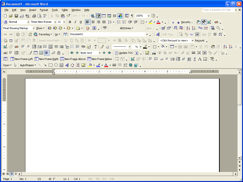
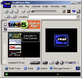
Still, more was more in software from the 1990s and 2000s. Yahoo, Microsoft Word, Internet Explorer, Real Player from this era resemble airplane cockpits and nuclear power plant control centres. In hindsight, how easy was it to find the play button on the Real Player? Where to enter a search query on Yahoo?
These screens are very full, because in these screens the aggregate interests and needs of everyone is represented. There is everything for everyone. Frequently used functions, rarely used functions, all next to each other in complete equality. From the point of view of an individual user, with her particular set of interests, most of the screen is filled with clutter, things she never needs. Still, everyone had to search these junkyard sales until they found what they, individually, needed. That took time and was unpopular, which eventually led to most functions disappearing again. Most of these pieces of software were replaced by simpler successors. A comparison with the respective successor interfaces shows that busy design wasn’t successful. There was a clear sweep of simplification over time.

Humans are not very good at finding things in cluttered environments. That’s how camouflage works.

If a UI is cluttered, muscle memory remembers a few control positions, so one can jump to them without looking. However, these well-remembered controls will be all those that are ever used. Too much work searching for the others. Tidying up, placing related controls together, grouping them by colour, size, shape, and brightness facilitate search and discovery to an extent. Still, Yahoo and the Real Player do this very little. Word and the Internet Explorer do this more, to salutary effect.

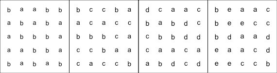
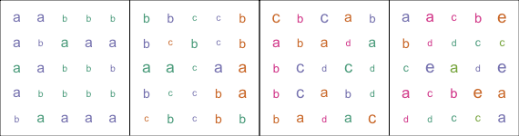
There are limits though. You can explore these limits easily yourself. In the figures below, start on the left, and try to find the letters “a” in the figures. At the beginning, with just a few different letters, the “a”s literally leap at you. Without any search you just see them. With matching colours and sizes it is even easier. But with increasing numbers of different letters, eventually not even matching colours and sizes will help. At this point, to find all the “a”s, you will have to scan the image with your eyes. That takes time and is tiresome. These examples are direct analogies to increasing numbers of controls on a screen. An “a” in a UI would be for example a certain kind of button, as opposed to other buttons. With too many kinds of buttons on the screen, with too few distinguishing features, finding a particular one becomes tiresome. The eye needs to laboriously scan the whole UI every single time.
Trying to cram more and more controls onto a screen is met with diminishing returns. For a while it is possible to distinguish controls using position, colour, size, spatial frequency, contrast, and shape differences. Keeping all controls coherent along an increasing number of dimensions (more coherent dimensions allow more groups) becomes however increasingly difficult. Maps are ultimate masterpieces of this art, and show what is possible with utmost effort. The use of visual layering, i.e. distinct and internally coherent features, let rivers, roads, cities, mountain ranges, elevations, vegetation types easily coexist on the best map sheets like the one below. These maps contain hundreds of bits of information per square centimeter. Achieving such information density in a coherent manner requires a lot of theory and art even for the static images that maps are. Ever-changing, dynamic user interfaces are usually far from this degree of coherence.

_at_Aviodrome_Lelystad.JPG)
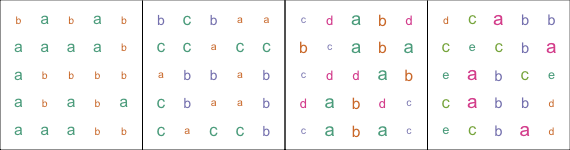
Woe betide those not careful about keeping features coherent. Try yourself. In the figures below colours and sizes are not kept coherent. Finding really all “a”s becomes quickly a frustrating exercise.
We now see how it is wrong that the Real Player very liberally mixed colours and shapes for all kinds of purposes. One almost can feel the pain of the designer, trying to find an even more garish combination of colours and shapes, so the latest additions to the UI still can be noticed. Yahoo wasn’t very consistent either. Microsoft Word was consistent, but used too few visual classes, so everything looks the same.
So we see the fundamental conflict. Powerful software needs more functions to cover everyone’s needs at all times. Humans are however not very good at finding those functions. Traditionally there have been two ways out of this conflict, a conflict between function number and the ability of humans to reach them all.
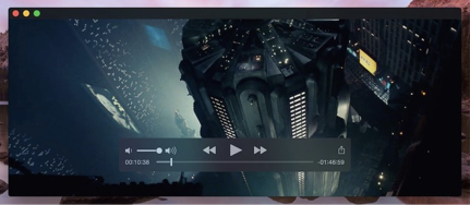
One solution was radical simplification and rigorous coherence of visual clues. Apple is the uncontested master. Her software rarely contains anything beyond what very nearly everyone regularly needs. And even with these few controls, the very-most-often used controls are larger and more prominent in the centre. See for example their video player with nothing but start, pause, forward, back. Content takes the central stage. In comparison, in the Real Player the video was a small, almost lost patch.
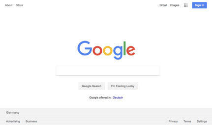
Moreover, iOS and Android became together the most successful operating systems on the planet through radical simplification. This is why people who couldn’t start a desktop computer love their smartphones. Mobile Safari for instance so much disappears in the background behind the web content, that it is difficult to google a photo of Safari on an iPhone despite its ubiquitous use. There is presumably no point of taking a photo of something that essentially isn’t there, hiding completely behind content.
The other solution are modal UIs. Modal UIs hide functions in submenus and subsubmenus and subsubsubmenus. This implements in essence a binary/ternary/… search. The user knows that what he needs is in menu C, then in submenu C1, subsubmenu C1f, subsubsubmenu C1f2. Think menu Format > Item Borders and Shading > tab Page Border > dropdown Art. So, fewer elements on the screen each time to search, but now four searches are needed instead of one. This of course assumes that the user knows her way from the beginning, no wrong turns, even when functions do not sort themselves neatly into categories. Voice menu systems are the same: “press nine for your balance, press zero for main menu.” Modal UI design, hated by Steve Jobs, is loved by Microsoft. Getting to a system setting of Windows frequently resembles a treasure hunt safari through several linked apps, windows, tabs, and menus. A different-looking, but same-functioning principle is embraced by the ribbon redesign of Microsoft Word. A big part of Microsoft professional certifications is to know by heart how to get to any function in their software.

Neither way is particularly satisfying. In one case functions are missing. In the other case functions might as well be missing, because no one finds them. Still, if done right, in either case at least the most frequently-used functions are prominent and easy to reach. So they are not entirely lost in clutter. For MacOS, the solution to some lacking specialist functions is to pack them into terminal commands. So in a way they are also merely hidden. For iOS the solution is to let them slowly creep back into the UI, re-creating the problems of yesteryear.
There is a lesson here, although neither of the two solutions was ultimately appealing. The lesson is that probability is the key to good UI design. Both solutions relied on the same probability calculation: which functions does the average user need most of the time? The (on average) more rarely used functions disappear behind longer UI paths, or completely. For the specialists: ideal modal UI path lengths are like symbol lengths in Huffman coding.
What if we improve on these absolute probabilities, and start to use conditional probabilities in UI design? In different words: what if the UI adapts to the current situation of the current user, and not only to the average situation of all users?
Such intelligence comes in steps of increasingly precise conditioning. Context menus are a first step. They often recognise content, and know that e.g. a URL is likely to be followed, a phone number called, a word looked up in a dictionary, a mistyped word corrected. Notice, that this seemingly simple notion saves the user from useless choices. There is little point to display an option for phone-calling the word “hippopotamus”, or looking up a URL in a dictionary. However, if software doesn’t know what the selected text means, it is either bound to display these useless options somewhere, or not have the functions at all.
A further step are location- and time-aware applications. They may pre-fill choices based on where you are, what time of day it is, and what you are doing. A map application may at start show where you are, since most people are interested in that. A music app may recommend to play morning-, evening-, or workout music as first choices, depending. A data entry mask may recommend nearby, large cities first, when entering a place. An entry mask may understand phone numbers differently depending on the location, and add the appropriate country code. These are alle examples of software with domain knowledge. They know the habits of people in specific situations. They know how a specific piece of geography, industry, or technology works.
A step up is management-by-exception software, where software deals with common situations itself, without bothering the user. The UI is therefore most of the time extremely simple. It contains only information pertinent to the situation. Sometimes software is confident enough in its choices to not only recommend actions, but usually to also take them. A glass cockpit in an airplane is a very highly developed example of management-by-exception software. Glass cockpits may still look perplexingly complex to the uninitiated, but with their help two people can do the work of four. In modern airplanes there is no flight engineer who constantly monitors fuel usage, engine revolutions, oil pressures, voltages. Neither is there a navigator who plots routes and keeps track of position. Their job was to free the two pilots’s attention, so they could focus on flying. Now, the airplane control software takes care of their jobs. The autopilot keeps the plane on route, and plots the current position on the current map segment. The software equivalent of an onboard engineer only involves the pilots if something goes wrong beyond the powers of the software. Unfortunately, if that does happen, pilots sometimes become overwhelmed by the simultaneous duties of flying the airplane, tending to an engineering problem, and taking care of emergency navigation. This however only shows how much well-designed software simplifies their lives when it works.

In any case, such software must know exactly when its powers end, and when it must ask the user. Moreover, the user must always have the last word. Otherwise, horrific things will happen, such as Boeing 747 Max planes fighting their own pilots until they crash. For a user to be able to judge software decisions, software must always be ready to explain in human terms how it arrived at its conclusions. Algorithms and visualisations like SHAP help.
Even more interesting is a cross between domain-specific knowledge and machine learning. Machine learning is all about learning conditional probabilities, and thus approximating unknown functions through experience. The outcome is not fundamentally different to the rules that are rigidly programmed into glass cockpits. The main difference is that software now learns itself how things work, and often better. In the simplest form software may learn the habits of its user. Where she lives, when she starts for work, how bad roads usually are, what she likes to listen to on the way. At work, a data entry mask may learn which items she most often uses, and what she usually enters. Automatic control software, such as stock control is a further example. Such software can anticipate future sales by learning from past sales and delivery patterns, choose the right model, and make appropriate orders. The software needs to involve a users’s attention only if there are shortages ahead which it can’t solve by itself: e.g. usual suppliers can’t replenish fast enough after a flash sale. The UI may remain extremely simple, as there is little to ask.
The best software with domain knowledge needs to ask very little indeed, like a human expert. For instance software might learn from job descriptions about how professions and skills go together. Now if the skills of an applicant are to be entered into this software, after one or two bits of information, the software may already offer the most likely further skills directly on the screen. It might know, that if someone is an office worker, he likely knows about text editors and spreadsheets. Perhaps also about taxes and accounting. Or sales. But it’s more likely either-or, and unlikely a combination of accounting AND sales. So if someone is more like a tax accountant, then sales is less likely to be offered, but auditing as a skill is more likely to show up. The alternative without domain knowledge would be searching in catalogs, needing to know the exact names of skills, or where they are to be found in a hierarchical ontology. In another instance, with domain knowledge about geography, and some understanding of human languages, a calendar software might not need to ask where an appointment takes place, if it is already deducible from the title of the appointment.
A little domain knowledge can replace a lot of UI. AI for instance can learn how music tastes work from music playing patterns of humans. Marilyn Manson, Diana Krall, and Bavarian Folk Music rarely combine in a playlist. It is therefore commonplace today that music playing software has a “Create Station” button based on one or more songs, or just the general preferences of the user. Perhaps combined with the time of day, or how the user feels. Compare this power of a single button with the misguided powers of iTunes, a piece of software universally disliked for its bloat. iTunes was very good software for music bureaucracy: cataloguing music, star-rating the music one likes, and compiling playlists. However, all but the most committed users didn’t want all this. They merely wanted to hear the right music at the right time. So the one UI element “Create Station”, was enough to make obsolete for most users dozens, if not hundreds of controls in the whole bureaucratic UI of iTunes.
There is another lesson here. If software knows what a good result is like, then the user is happier not having to explain it. The more bureaucratic software will eventually die out. For instance painting a realistic image of a landscape, or beautifying a portrait of someone involves a very large number of actions in a very complex piece of software like Photoshop. During editing, the artist uses her domain knowledge what a realistic landscape, or what a human body looks like. She also needs to know how exactly to use the tools in Photoshop to arrive at a realistic result. These tools will have no compunctions to produce less than realistic results, if so directed. They don’t know what is right and what is wrong from the view of the user.
What if software knows what a landscape looks like? Then the user needs to give only very few parameters: where to put the river, where are the trees, is there a mountain, or a seaside? AI puts these elements together to a result within the domain of good-looking landscapes. The same goes for painting a realistic face, or cats, or houses, or designing shoes and handbags. Or retouching photos. Try these tools yourself. See more here. Early days, but the direction is clear. The makers of Photoshop know this. That’s why they add smart selection and smart filling, and all the other smart tools.

AI-based UI will win in any domain where the space of possibilities is much larger than the space of instances considered successful. Think all possible drawings versus those that someone might consider beautiful. In these cases much fewer questions need to be asked by the software if there is domain knowledge. Paintings, for example can be done by hand from a photo, making all decisions oneself, or by software that learns the style of different artists.

Music can be composed note-by-note, or a piece of software can imitate the style of some era, and only ask about user preferences with regard to things that were typically varied in that era. Already entirely common and successful are automatic photo retouching. Animojis, another succesful example would have until recently employed whole animation studios for hand-drawing, controlling thousands of parameters in animation software. Now software merely “asks” for head position, facial expression, and which animal you would like to be. In these areas, where domain knowledge is of any use, software with built-in knowledge will rapidly displace current software for all but the most specialised purposes. They are just much easier to use, because they ask much less. For most kinds of domain knowledge, AI is the fastest way to gather the knowledge. Therefore, AIs will increasingly drive UIs that already anticipate the needs of the user in each situation. That need to ask very little.
There are some risks here, too. AI-based UI today mostly works because it restricts what you can do. It doesn’t let you do unexpected things — for good reasons, since most novel choices are conventionally considered unsuccessful. With current AI-landscape editors you just can’t paint an old tree whose top is partially a cathedral. But this also stifles experimentation and breeds uniformity. We have to be careful that future AI-based UI does not restrict experimentation. We must not allow art become just a stale, ossified remix of earlier successes. We need to give space for trying new things and changing convention. Much of what we consider beautiful we only do because that’s what we grew up with. Our love for the pop music of our youths should remind everyone of this. The uniformity of Byzantine art over centuries should frighten us. We need to use the power of AI-based UIs well.
If you sell software and your software cannot guess most user inputs in advance, then you should be worried and improve it. Software for writing needs to know how to write, style, and format a simple text according to the purpose; image editors need to know how to optimise a photo and keep a landscape realistic while a user edits it; a scanning software needs to straighten, rotate and colour-balance an image by itself; your code-editor needs to understand code; a CAD-program needs to know what common 3D-objects look like; a 2D-program needs to know shapes; a car needs to know how to drive; a central heating needs to know the habits of the house; banking software needs to know what customers want to know about their cash-flow, and how to invest for them.
A good butler understands his master without a word. Knows what the user is likely to want at any moment. Asks only if there is any doubt. Explains itself if needed. Then only presents the most pertinent choices. Nonetheless leaves the user always the last word, and all choices if he wants them — he could have misjudged his master. Maintains a balance of risk and convenience. These are the keys for combining power with ease of use. Beyond a certain complexity, only an AI can do this.