![David Molnar [Update:, PhD]](https://www.srcf.ucam.org/~dm516/wp-content/themes/twentyeleven/images/headers/chessboard.jpg)
Regular lines in the background of barplots are useful, but they are never where they need to be. Then the guessing begins: how far is that bar from the guide?
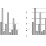
In the comparisons below the regular lines look more Zen peaceful, but the lines at bar levels are much more useful in comparing bar heights. In the first graphs the guides show that some bars with similar heights are not quite equal, and in the second graph it becomes immediately apparent, that there are three distinct groups of values.
This little R snippet does the job:
prettybarplot <- function(yvalues, labels=NULL){
 barplot(height=yvalues, names.arg=labels, axes=FALSE)
 abline(h=yvalues)
 barplot(height=yvalues, names.arg=labels, add=TRUE, axes=FALSE)
 axis(side=2, col="white", col.ticks="black", line = 1, xpd=TRUE )
}