![David Molnar [Update:, PhD]](https://www.srcf.ucam.org/~dm516/wp-content/themes/twentyeleven/images/headers/chessboard.jpg)
An earlier post explored the winning and losing parts of London, as measured by the success of different kinds of cheap and expensive food-selling enterprises.
Assayed the same way (with the same shortcomings, too!), how did the rest of the UK do? A first answer is: outside London, not many places have done very well, but the Sheffield area is a clear winner. Less densely populated areas are the ones losing most.
Everyone has different questions though: are cheap or expensive venues becoming more successful where I (want to) live? What kind of shops are opening in the South-West? Which parts of the country is Pizza Chain X focusing on? In the linked interactive map I created you can look for yourself. The map answers both questions about the whole of the UK, and about favourite counties, cities or boroughs (just zoom in!).
As a practical note, sometimes a far out region appears surprisingly full of activity. It is worth double-checking this. It may be because the local authority dumped or purged a lot of businesses at the same time (usually in smaller places). It helps to just shift this area to one side, and then the heat map will return to a more useful scale for the rest.
The list below the map shows the coming and going businesses in the area you are looking at. In the left pane you can filter by business name or type, e.g. if you were wondering what supermarkets or specifically Tesco does in a particular area.
Feedback is most welcome below this post. For the future I am considering adding comparisons between different time periods to make this tool even more useful. Please be kind to the tiny server if it is slow. My thanks to the makers of R, Shiny, ggmap and leaflet, and to EC2 for the server.
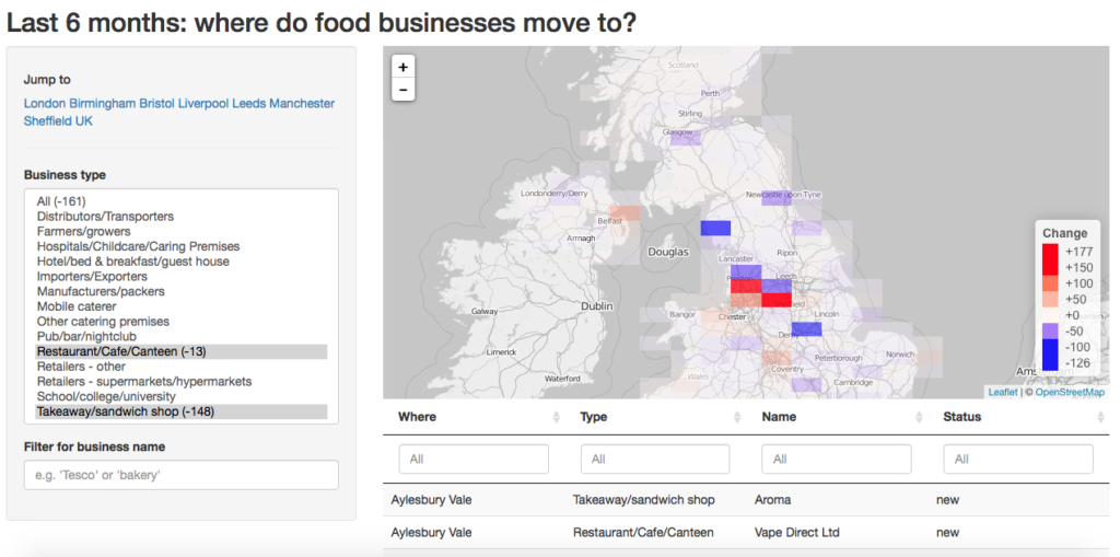
New and closing restaurants and sandwich shops in the UK.